
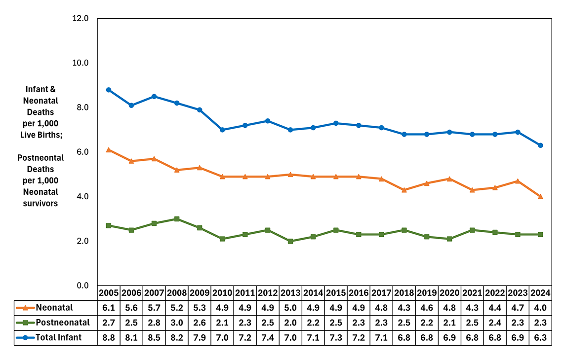
Figure Summary: This line graph presents trends in infant, neonatal and postneonatal deaths over the last two decades (2005-2024). Infant deaths represent the death of a liveborn infant within the first year of life (less than 365 days). Infant death rates are presented per 1,000 live births. Neonatal deaths represent the death of a liveborn infant under 28 days of age. Neonatal rates are presented per 1,000 live births. Postneonatal deaths represent the death of a liveborn infant age 28 days and over but less than one year of age. Postneonatal rates are presented per 1,000 neonatal survivors (live births minus neonatal deaths). The table below presents the data in tabular form.
| Year | Neonatal | Postneonatal | Total Infant |
|---|---|---|---|
| 2005 | 6.1 | 2.7 | 8.8 |
| 2006 | 5.6 | 2.5 | 8.1 |
| 2007 | 5.7 | 2.8 | 8.5 |
| 2008 | 5.2 | 3.0 | 8.2 |
| 2009 | 5.3 | 2.6 | 7.9 |
| 2010 | 4.9 | 2.1 | 7.0 |
| 2011 | 4.9 | 2.3 | 7.2 |
| 2012 | 4.9 | 2.5 | 7.4 |
| 2013 | 5.0 | 2.0 | 7.0 |
| 2014 | 4.9 | 2.2 | 7.1 |
| 2015 | 4.9 | 2.5 | 7.3 |
| 2016 | 4.9 | 2.3 | 7.2 |
| 2017 | 4.8 | 2.3 | 7.1 |
| 2018 | 4.3 | 2.5 | 6.8 |
| 2019 | 4.6 | 2.2 | 6.8 |
| 2020 | 4.8 | 2.1 | 6.9 |
| 2021 | 4.3 | 2.5 | 6.8 |
| 2022 | 4.4 | 2.4 | 6.8 |
| 2023 | 4.7 | 2.3 | 6.9 |
| 2024 | 4.0 | 2.3 | 6.3 |

FOLLOW US